Howdy! I wanted to dive into my latest design project, and show how I arrived at the final result. I was commissioned to design a T-Shirt design for the neighborhood where I live in New York City, El Barrio (AKA Spanish Harlem). My process always starts with sketching, and visual and historical research into the subject. This will explain how I move on from that point in digitizing and finalizing my design work.
1. Research & First Draft
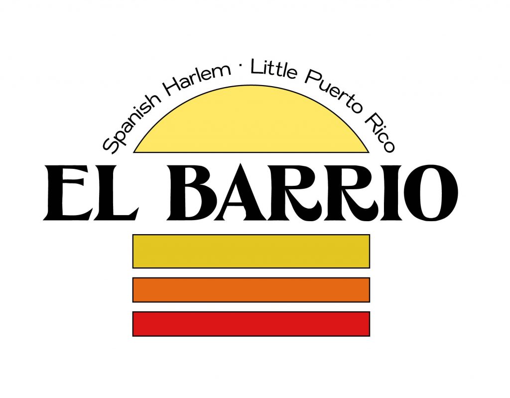
After exploring the neighborhood, and researching its history, I wanted to capture the old-school 1970s feel of the neighborhood, with all its inherent charm. Spanish Harlem is a bit anachronistic; the neighborhood has a slower pace than the rest of Manhattan. Old men play chess on the street, and the scent of cuchifritos wafts through the air. The goal of the design was to capture the laid-back, almost magical feel that El Barrio has at twilight.
First, I chose fonts extracted from hand painted letters, to add to the vintage aesthetic, and tie the design to the tradition of hand-painted signs in Latin America. Next, I added a sunset-like graphic to capture the feeling of the late evening.
2. Refinement & Reformatting
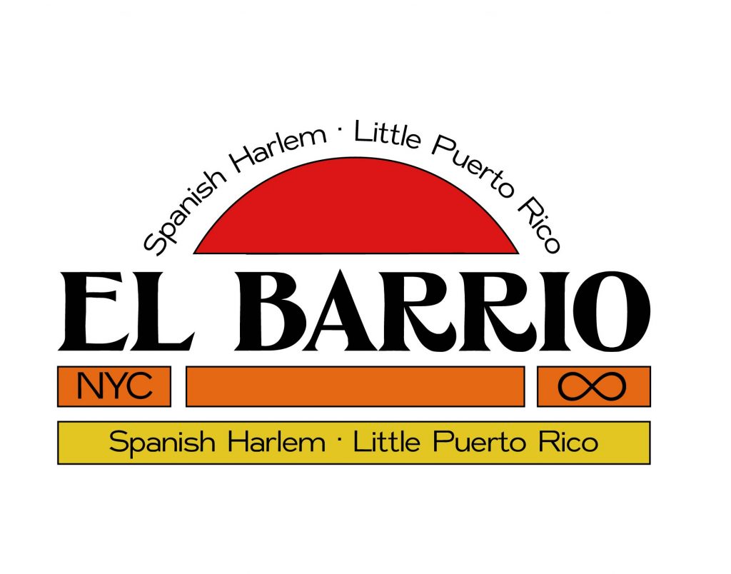
Next, I played around with the sunset motif, and ended up with a layout that was a little more cohesive and compelling. But I was not a fan of the colors… I wanted the design to work as a one-color screen print.
3. Refocusing & Exploring
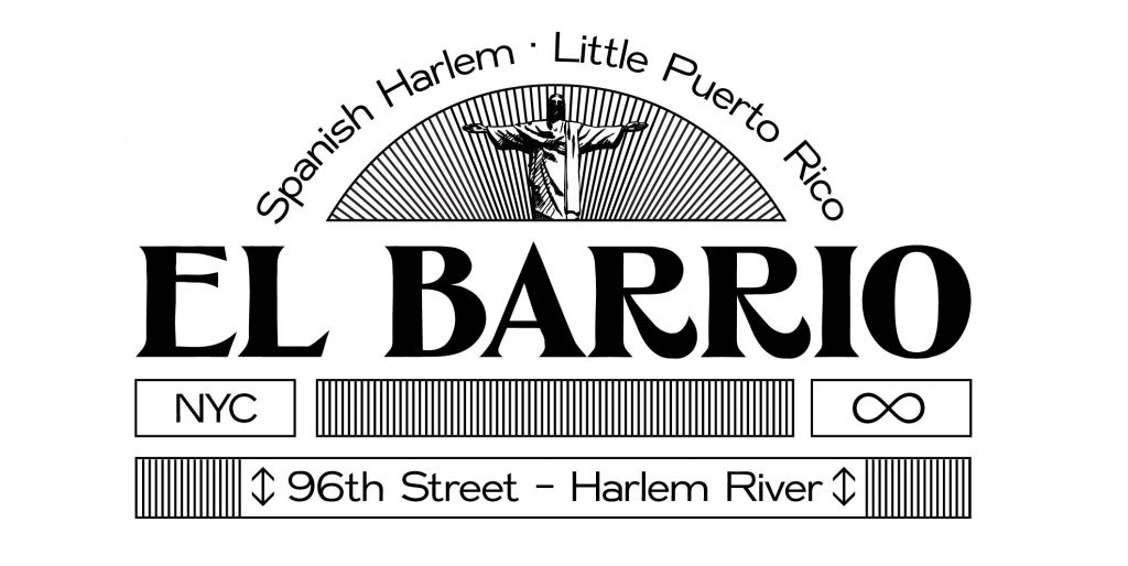
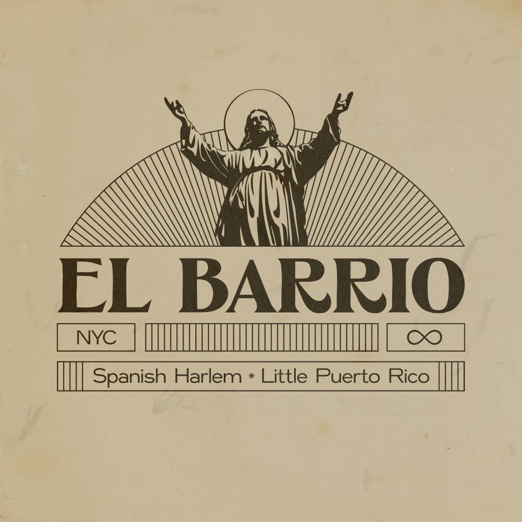
To make the design screen-printable, I stripped the color and added in some lines to give a bit of depth to the design. Then I had the idea to incorporate an image of Jesus. El Barrio is NYC’s original Puerto Rican neighborhood , and has a strong Catholic population. I added in a mini Jesus figure to the top of the design. At this point, I started to feel like I was really on to something great. But I tend to be a maximalist, so an essential part of my design process is to step back, edit myself, and strip back the design to the essential elements.
4. Editing & Refining
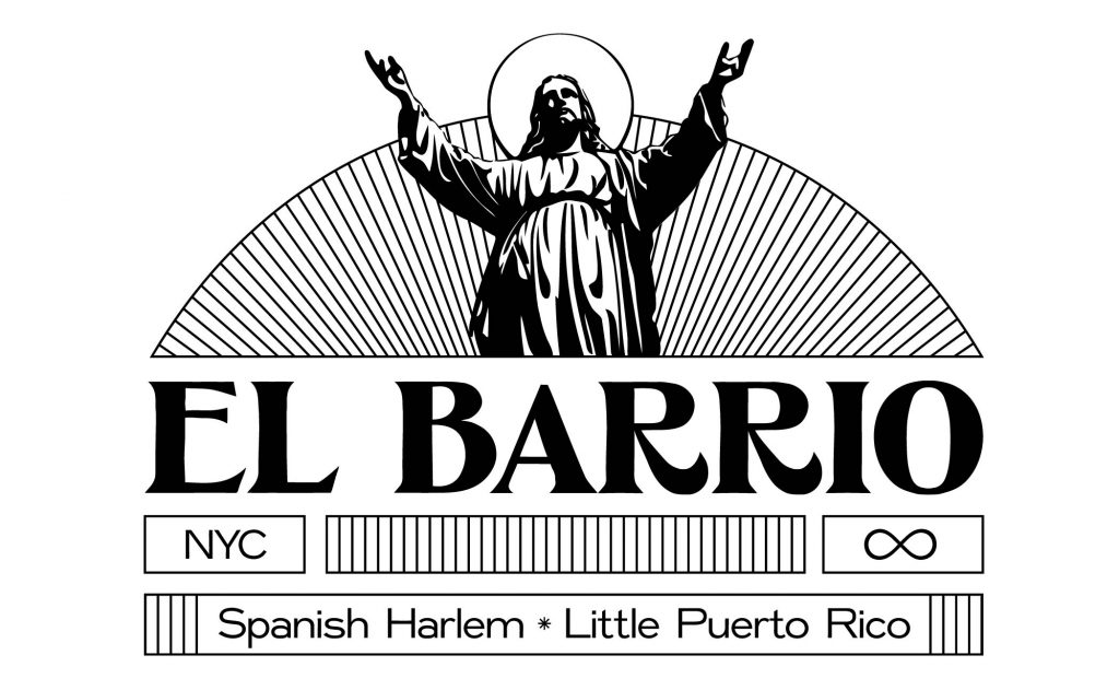
At this point, the design had WAY too much going on. First, I scrapped the text on the top, and made Jesus way bigger; making him the focal point of the design. Next, I spaced out the line work to eliminate the mind numbing optical illusion effect the close-together lines were giving. Finally, I changed the text on the bottom to explicitly define the neighborhood, rather than reference its borders.
That’s All Folks!
So that’s it! The design finally captured the magic of the neighborhood. Branding the neighborhood I live in made me slow down and appreciate the unique qualities around me. The best art always comes from observation. Make sure to spend some time with your subject as part of your design process!
Think this design is rad? Be sure to follow me over on the ‘gram for the latest projects and funscapades.
Follow @danegoodies
Related Posts
How to Trust your Intuition when You’re Making a Decision
When you are alone for days or weeks at a time, you eventually become drawn to…
Everyday inspired by the Beauty of the Mountains
Last year I wrote about why booking too far in advance can be dangerous for…
How to Appreciate the Little Things in Life and be Happy
Just the other day I happened to wake up early. That is unusual for an…